
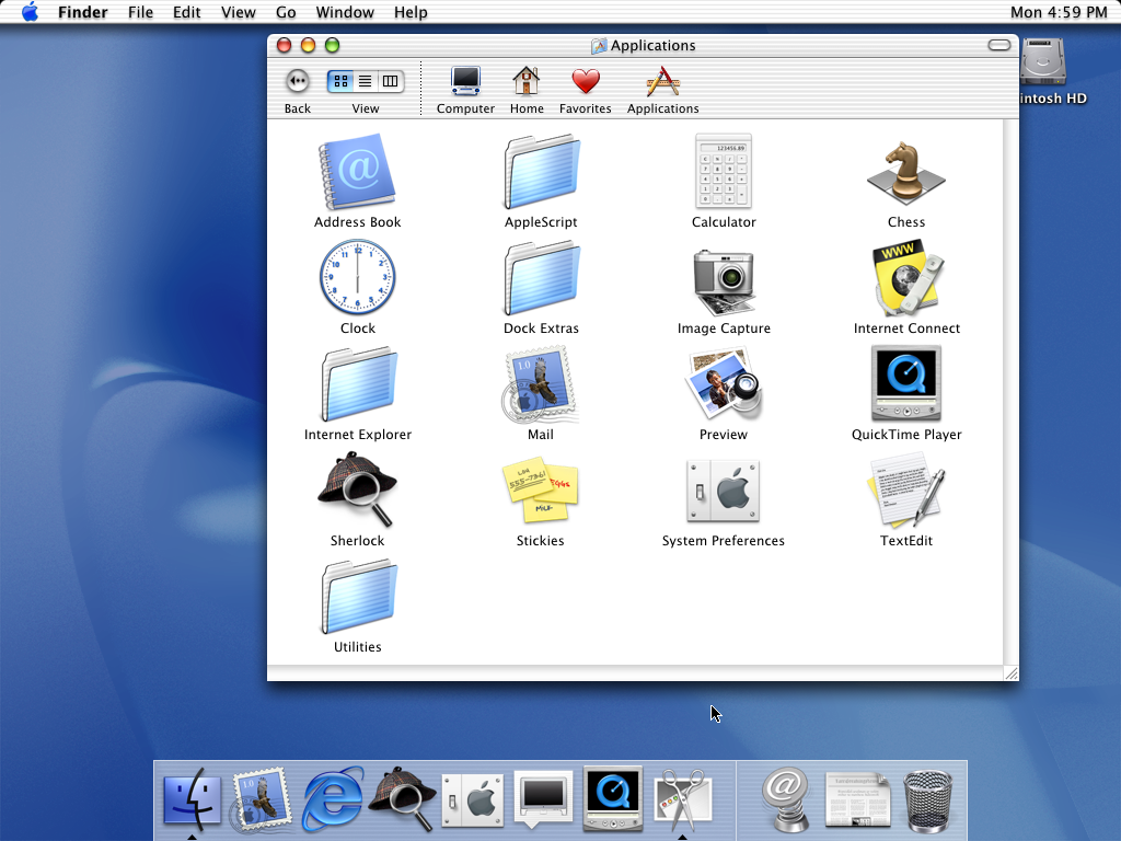
Traffic light buttons were already equidistant to the edge of the window. Now they are trying to center circles in squircles[1], breaking window edges and draggability, etc.
> It creates a larger inconsistency than the "consistency" it supposedly brings.
That's why I am baffled (as many commenters here) - how did this went out all the way to release, instead of ending as an experiment at design floor.
[1] parent comment: https://news.ycombinator.com/item?id=47321065
Notice two things:
1) The window chrome with traffic lights and title is entirely separate from the toolbar, not unified with the toolbar.
2) The top of the window is rounded, but the bottom of the window is not!
I think the old design was superior for several reasons, one of which is that it made the windows much easier to drag around the screen. In any case, though, even if there's an argument about concentricity and window controls, it makes no sense that the bottom of the window has the same corner radius as the top when the toolbar is only at the top.
A better solution would be to adjust the sizing/placement of the window controls (and allow the hit area to include the original placement maybe?).