
You need to denote a button is different from text. You need feedback that a UI element was interacted with, and for toggles you need for people to be able to tell what represents on vs off. The borders between different UI elements needs to be clearly defined, etc etc.
The more you can ground what you're teaching in real world terms, the easier it is to teach. And in the moments where it does deviate from real world conditions, that's where it becomes harder to learn, since now you have to remember exceptions in behaviour compared to what you already know.
Having computers imitate real world items is useful, because it provides a reference to other things rather than just being its own unique thing. This is useful even if you have never actually used it outside of a computer setting. A stereotypical telephone receiver icon almost always means 'call', even if you've never used a landline phone (much less one that's shaped like that icon usually is). Nobody has ever used a real-world hamburger menu, yet it's described in skeumorphic terms, since it's easier to explain and relate to.
Skeuomorphic UIs absolutely have a place in things like games and tutorials for the youngest of children (like 5-6 yr olds, max), but past that, I honestly think labelling, a UI with feedback after significant inputs (like sounds, button states being extremely distinct, animations, etc), and not overcrowding the UI with too many controls and jargon will all go much further than skeuomorphism.
Screw the dyslexic and colourblind, I guess.
> using descriptive naming in buttons and having self-documenting labels.
Screw the non(-native)-English speaking in this case.
And even in the case that you're a native speaker, this is really hard to do well. You should try. Most fail.
I agree you should do these things, and many of your other suggestions (within reason) if only to give your users a better chance at understanding your software, but they cannot replace a solid grounding in the real world. We should have both.
What's clearer? [Call] or [(telephone receiver emoji) Call]?
You can also use checkmark/cross icons for success/failure. And What does this have to do with dyslexia?
> What's clearer? [Call] or [(telephone receiver emoji) Call]?
We’re arguing about flat vs. skeuomorphic design, so more like:
What's clearer? [(simple phone icon) Call] or [(photorealistic drawing of a telephone receiver) Call]?
Your comment on typography.
> What's clearer? [(simple phone icon) Call] or [(photorealistic drawing of a telephone receiver) Call]?
The latter.
That wasn’t my comment, and GP was presumably referring to things like headings being larger, not some subtle differences that dyslexic people would miss.
> The latter.
Why?
Sorry about that.
> and GP was presumably referring to things like headings being larger, not some subtle differences that dyslexic people would miss.
I was imagining bold or italics, both of which are easily missed by people who are dyslectic, or using different type faces, which can trip them up. Headings can help, if the text and spacing is suitably big, but I'm not sure what situations that can help much with in typical usage. I'm having a hard time thinking of examples where I would do that beyond what's already common.
> Why?
Easier to recognise as what it's supposed to be and easier to distinguish from other icons. More distinct traits in icons help you recognise something for what it is more quickly.
It's possible to have a flat style but have buttons that look clearly like buttons, and elements that have shadows and colors.
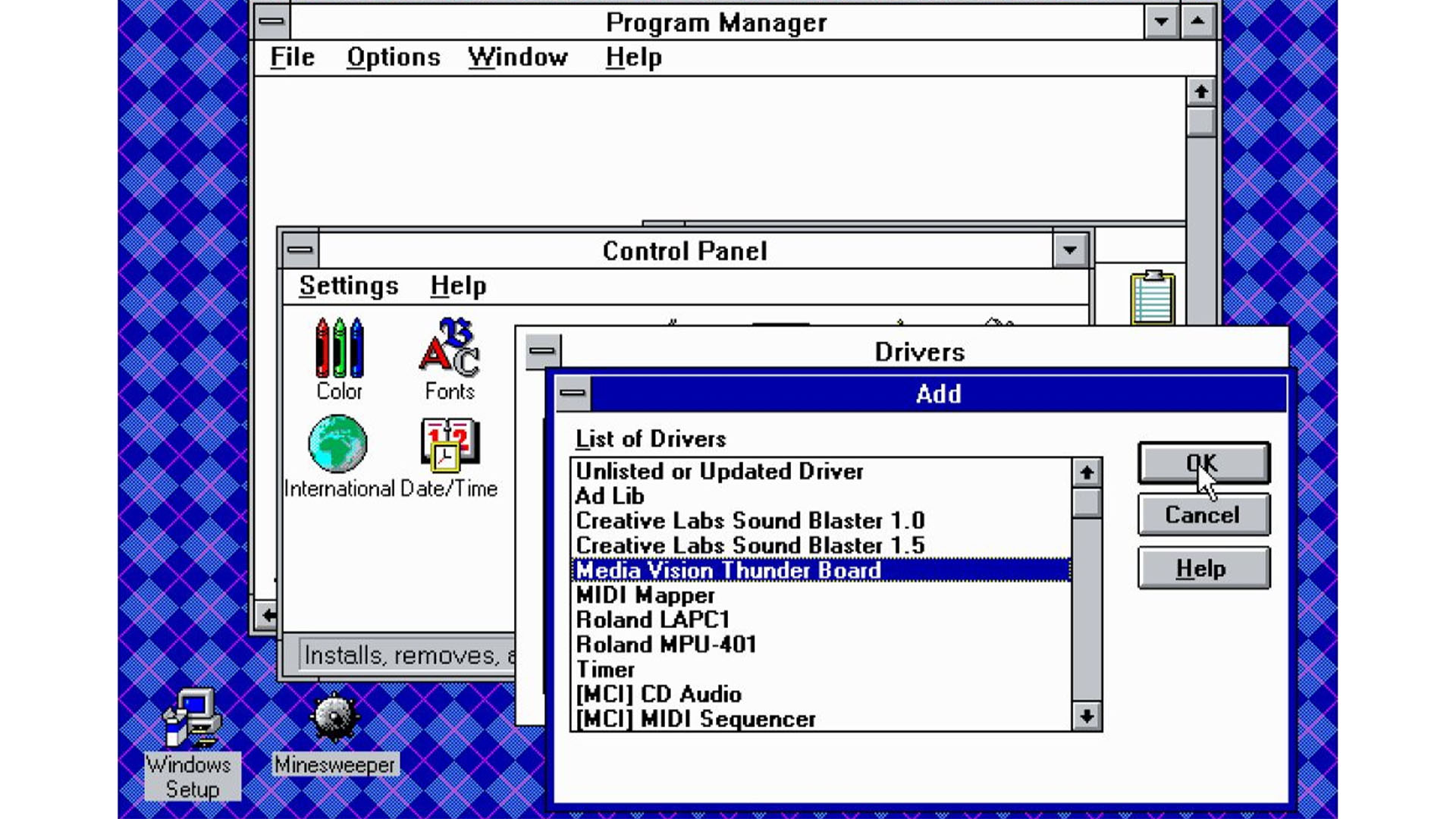
Nobody seemed to have a problem with it. It was largely clear what was a button and what was a checkbox. In hindsight it was certainly uglier than the 95 style (maybe just because I grew up with that) but it wasn't unusable at all. As you say, it was clear what was a button, what was a checkbox. I think it was because GUIs were mostly made out of standardized elements whereas today we have everyone trying to put their unique spin on every element.
We have to go all the way back to Windows 2 in before we find flatness.
[1] https://web.archive.org/web/20220418124401/https://techland....
a) a different statement from "I prefer X"
and
b) pretty low effort, trivially to Google (or ask AI) and generally a bit on the ignorant side
A better reply would not just have said what it said but contained actual wonder about the topic. Like this, it's just indistinguishable from engagement bait.
I know the most common reason why people prefer skeuomorphic design (the visual metaphor), which is why my original reply directly addressed this complaint by saying that it’s no longer relevant. Some other complaints I’ve found online are about specific bad instances of flat design rather than flat designs in general. Therefore, I am asking about reasons that don’t fall under these two categories, which I haven’t been able to find.
A core issue is UI is a language and by reinventing things from scratch you ended up with some designs choosing A to represent something toggled on, and some designs using A to show the exact opposite. Thus a user needed to interact with that specific design to learn core functionality.
The parents question seems reasonable to my non designy mind.
No on the Internet.
Especially not on the sea-lion infested HR-world Internet, in which trolling has evolved to exploit good faith directly.
___
In fact, "being overly hostile" is exactly how you probe to see whether your suspicions are correct.
Sea lioning exploits the gap between what would be a real human thing to do and what still passes as what a real human would do.
So to get useful data, you need to modulate parameters so that people end up outside of that gap window.
Essentially you're probing for genuine Human-ness by creating a context in which the bad faith action space is no longer overlapping with the genuine human action space.
This works, because genuine humans have this amazing ability to reconcile and actually genuinely resolve misunderstandings. Something that is fundamentally impossible for bad faith actors.
(This should not be understood as "just be overly hostile" because simply being a dick doesn't provide any data at all.)
If you're a dick for a reason, you're still being a dick. (Your word not mine)
And I don't see how your approach makes discourse any better.
To me the parents question was reasonable. Skeuomorphism was designed for people that may never have seen a computer before. Do we need to still be clicking a floppy disc to save a file?
There's probably differences in how you define flat design. You could include all the issues of current implementations in that definition, or you could say that the burger menu is just bad UX and could be fixed without going back to skeuomorphism.
But you haven't really delved into that.
Dude, are you also playing that script or what?
Of course you do not engage on the level the possibly malicious party wants you to engage, because if you do that, you play their game by their rules.
Have you even tried engaging with what I just said? (inb4 "but you didn't do either!!111")
God, this fucking platform. Whatever man. Go have fun being dragged (or dragging others) into never-ending bad-faith arguments.
FOMO for sure is one of the driving factors.
"We cannot risk looking outdated". So weak management, probably.
But also talent availability I suppose. If there's a new trend, the pool of people you can hire include many that are in on that trend.
UI frameworks too, probably. The modern thing™ does the modern thing™ and you do want to be on the modern thing, because you fear that only that receives security fixes or whatever.
I really don't think that "keeping people entertained" is a sensible goal within the context of building software as tools and not software-adjacent Art.
Which is not to say that I would not want a great and polished experience, but that is not equivalent to "being entertained".
___
It would be nice if not everything one interacts with would try to get some sort of emotion out of me. Bring back being bored.
I don't think I know any non-tech people who like things changing about. Some tech people like that (I don't), but for the non-techy, it's just another thing they have to relearn for no good reason.
As opposed to what? Be entertained by all the bells and whistles of modern operating systems that have practically unusable user interfaces?
Although in 3.1 it was easy to tell what was interactable, despite being flat. I attribute this to the use of standardized components almost everywhere.
https://www.custompc.com/wp-content/sites/custompc/2023/06/W...