
They all compromise on something to enhance something else. You simply can't map the surface of a 3d shere (approximation of the earths globe) onto a 2d flat surface.
And so we have projections galore. And anyway was (and is) always free to use whatever fits best.
From my side of the world (Europe), this whole "Mercator projection is associated with colonialism" drama seems to have originated a couple of years ago in the US and was mostly amplified by artificial social media outrage.
That this map is a derivative of "a decolonization map", should be clear to anyone that this is just political posturing and not anything of actual use.
It makes sense they'd have a default and this would switch it.
It's also good for knowing how much daylight you get somewhere or whether someone there is likely to be awake right now.
Based on some quick search the atlas I used in school in Germany mostly used winkel-tripel projection (or the eckert IV). Does my memory remember the map accurate enough to determine that now? Hell no.
> Mercator useful for sailing
This is the only correct answer, and everything else is unscientific nonsense. It hasn't been replaced because... it just hasn't. Mercator + knots + nautical miles is a system that is extremely useful for navigation. Since we aren't sailing ships around a whole lot anymore, a lot of teachers forget to mention the relationship between the three. I imagine that was more common knowledge back in the day.
That being said, I do like the new proposed projection for how we use maps today. I think another useful tool would simply be overlay maps.
It is also used by the military (or at least NATO). They use https://en.wikipedia.org/wiki/Universal_Transverse_Mercator_...
While most of that system is a way to tag coordinates that are "simpler" than just latitude and longitude to a position, it's underlying system is also the Mercator projection. And some properties of Mercator, e.g. that it is angle-correct. So you can use UTM e.g. in Elint for direction finding.
It's not distance or area correct, but for normal infantry this is meaningless, since this only shows on large scales, but not the slow scales of infantry.
It was adopted by the US military between WWI and WWII, and similar projections were adopted by other militaries around the same time, because earlier (non-conformal) map projections led to dramatic errors when they were used for artillery targeting.
Blame the French for reinventing the wheel instead of, say, using a 1/1000th of a nautical mile as the definition of the metre. Alas, that's all water under the bridge by now.
If you want to do navigation in SI units, the UTM projections (see sibling thread) typically do positioning in metres inside each grid square.
full circle is 400 grad, so a right angle (10,000 km) is 100 grad.
Then minutes and seconds are factors of 100, so a centesimal minute is 1 km and 1 centesimal second is 10 m.
The UN is a ceremonial organization that occasionally we get agreement on measurement units.
That's not what they teach in school though, and I think that genuinely is misinformation for Americans trying to understand international relations.
K12 teachers could almost get away with the one sentence: "Right is only a question among equals, for the strong do what they can, and the weak suffer as they must."
Here is the UK in Africa: https://thetruesize.com/#?borders=1~!MTAyODQ3Nzg.NTkyNDI2Nw*...
Note of course this includes Scotland! The traditional English are basically a dot.
All the large continents are near the equator and hence the relative size of Africa, Australia, North/South America, Asia is not affected much by the projection. Antarctica is big too, even though wildly exaggerated by Mercator.
If anything, it makes more sense to say people don't realize how small UK/Europe is.
And I wouldn't call 29.6 <> 21.3 a little smaller, Africa is 39% bigger than North America.
Don't worry; Americans assume as a matter of course that England includes Scotland. Your internal political divisions are of interest only to you.
The widget also appears to include Northern Ireland, which, unlike Scotland, Americans probably wouldn't expect.
And then right at the bottom it went and mentioned Dymaxion.
Dymaxion is one of the few projections that actually shows Antarctica with something resembling its actual shape. Interestingly, to counter the people who say that the best thing to learn from is an actual globe, a couple of children's globes of the world that I had as a child had large metal caps around the axle that obscured most of Antarctica.
Any decent atlas uses a variety of projections, of course. The tatty, second-hand, older-than-I-am atlas that I had at school was already on to Interrupted Mollweide's Homolographic by page 3. (-:
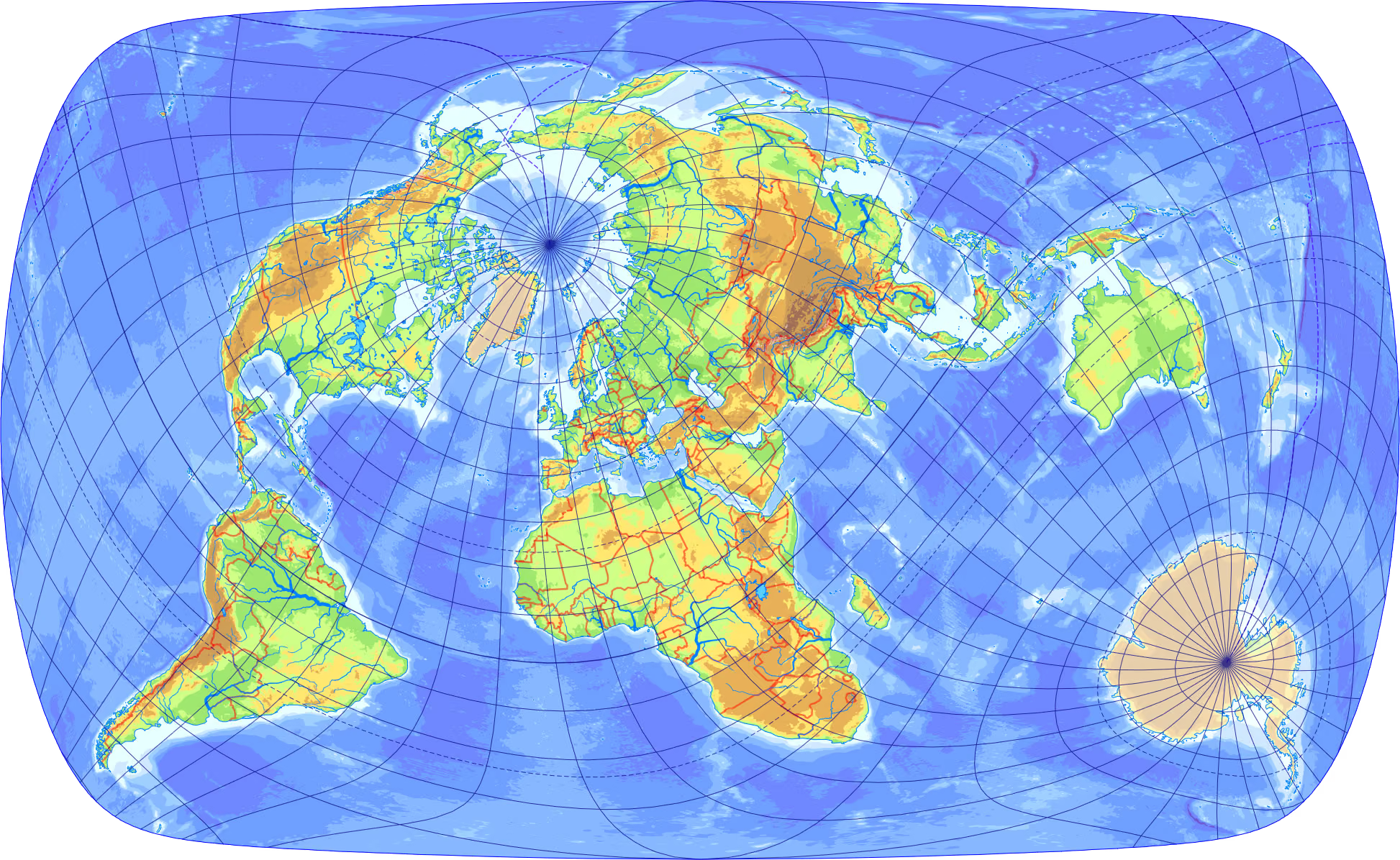
I might be asking bit too much but I want Antarctica to be shown correctly, I want all microstates to be shown, I want all the "(UK)" and "(FR)" mentions for overseas territories to be there, ideally Taipei to be shown as a capital, etc, and that's only what I care about, I'm sure there are dozens of other details I don't think of that are wrong on most maps.
I ended up making my own world map with d3 (that was 10 years ago, I don't know what I would use today) and print it at a print shop. I printed a dymaxion map (with ocean blue for the gaps) and another more "normal" projection though I don't actually remember which one, with Antarctica as an insert. It wasn't even expensive, and in addition I was able to put all the names in both French and Dutch.
You might assume that in Belgium, it would at least be possible to find bilingual maps but no, if you can find one that's not in English you're already lucky.
"I had toy globes which, unlike actual globes, covered up significant chunks of Earth, so actual globes are bad"
Solid logic, mate.
At least in Germany (and both former East and West) it certainly isn't in use since at least the 1950s (and probably much earlier), but instead a projection type that maps land masses closer to their actual relative sizes. Mercator is extremely rare and only used in very specialized professional maps (e.g. for navigation), but certainly not as the popular map projection in education.
Also don't schools use physical globes anymore?
This whole drama sounds like it's about a century late to the party tbh.
But still, it's not a red flag in this particular example.
This explains why the UN is making such an otherwise stupid resolution from a mathematical point of view.
A version of it including political borders my desktop wallpaper for a long time, until I decided to not change default wallpaper on my new devices anymore.
(I.e., all the webpages with a rotating globe with "News" spelled around it in the fashion of the animated Universal logo, embedded as an animated GIF [GIF89a].)
There was in fact a rival 0 longitude line passing through Paris, France, that the French used for many years before standardizing on the British system; although this system would equally have resulted in the 0,0 point being somewhere in the ocean west of the African coast.
...OTH if Britain wouldn't have been a globe-spanning empire, they wouldn't have needed a more precise way to measure longitude, and probably wouldn't have invented it ;)
E.g. the Brits had built a whole government body around the task, which then resulted in a competition, with Harrison's chronometer coming out as winner:
The causality you gloss over seems to be more important than the causality you'd like us to focus on. The ships came first.
Empire -> need for chronometers -> chronometers.
Mercator is far more globally evenhanded in that regard, being a cylindrical projection.
The Washington meridians are four meridians that were used as prime meridians in the United States which pass through Washington, D.C.https://en.wikipedia.org/wiki/Lake_Tahoe#Interstate_boundary...
In summary there is a border dispute between California and Nevada, It was exacerbated by some surveying errors but the real problem appears to be the definitions of the sate borders, California was defined using one method(120 degrees longitude west of Greenwich) and Nevada was defined using another method (37 degrees longitude west of Washington) at the time it was thought these two methods were equivalent but it later turned out they are not. Congress does not have the authority to change state borders so it is up to the states to reach an agreement. and they have not. So the dispute is still technically on going.
Researching this also lead to the most hilarious passive aggressive thing I have seen in a constitution.
"All territory lying West of and adjoining the boundary line herein prescribed, which the State of California may relinquish to the Territory or State of Nevada, shall thereupon be embraced within and constitute a part of this State."
We really wanted that area east of the Sierra Nevada mountains, they would form a perfect natural boundary, but CA has already claimed it. If CA ever wants to give it up we want to make sure it is explicitly in the constitution to accept it.
Featuring all 244 American States!
Other map projections (we have hundreds!) compromise on other things to improve on others. See https://en.wikipedia.org/wiki/Map_projections
So yes, we definitely NEED compromise and not some strongman that says, due to limited knowledge "it is how it is, forever".
Will countries actually change their map projections? That has yet to be seen. Maybe they will, maybe they won't That has yet to be seen.
The key term some people never learned in school is "direct democracy" vs. "indirect democracy".
Even many clubs, e.g. in Germany the ADAC, have systems where people vote for an assembly (or, in politics: a parliament). And then the assembly vote fot ehri CO (or, in politics, for their chancellor). Now, it can happen that this chancellor together with 26 other head of states is a member of the Europen Council (EUCO, one of the 7 bodies of the EU, what btw most people all the time intermingle). And that this EUCO now votes on their president.
In your logic, this presidency of the EUCO is then null and void. Because not directly elected by citizens of the EU.
In my logic, I realize that this position is removed from the people, but it still done by a democratic process. A multi-stage process, but still democratic. And that it still has some bearing.
Asking for the whole world population having an election on e.g. the UN Secretary General --- under the implication that only this would give representation --- is bogus.
I implied instead that there is a crisis in representation.
(...You could be German and you have not noticed, in spite of all the vocal effort in the North? That and all the other similar signals clearly affecting current history.)
No one is forcing you to use the new map, you can keep your old map. No one will arrest you for it. Enjoy!
Also, the UN voted to use this map for itself and suggested (!) that others should use it. It never said that everyone has to use that map. It actually said that this voting is "non-binding".
An equal area projection map is obviously valuable. But it's practically asinine to pick a projection that distorts land features when there are several equal area projections that do not.
Further, Ukraine had to abstain from this vote because they shoehorned in something ridiculous considering the official position of the UN members that Crimea is Ukraine [1], and Crimea is depicted as outside of Ukraine.
I have no idea if there are other hidden yet important changes, since there is hardly any commentary apart from size and shape.
[1] https://ukraine-war-analytics.com/history/international-reco...
As best I can tell the Ukrainian ambassador saw the example map made by the Equal Earth creator in 2014 with its somewhat questionable choice in colouring Crimea and saw an opportunity for virtue signalling. Or maybe he really thought the vote was about that specific political map from 2014.
https://commons.wikimedia.org/wiki/File:Comparison_of_Equal_...

Whichever you prefer, what matters is that we should all just stop using Mercator.
I have a Waterman on my wall :)
Equal Earth is basically Robinson with a more straightforward formula and accurate areas.
Equal earth also has its uses, it's a neat and clean map, but has more distortion in shape, which might be undesirable.
It's totally reasonable and rational for the African association of cartographer to push for this change - it makes their continent look bigger. At the margin, their children can look at the map and feel more significant.
On the flip side, this particular map makes Europe look smaller. So it means that at the margin, European children will look at the map and feel less significant.
It doesn't shock me that the US voted against it. I am surprised that others voted for it, and diminished themselves.
They might instead feel even more more "important" for achieving so much with such a small territory. I know I was somewhat shocked as a kid when I learnt that France was that small country when I had always thought for some reason that it was Greenland (vaguely the same shape I guess, and big enough to feel like it was important. It was certainly not a Mercator projection by the way, Greenland was still a reasonable size on that map on the wall in the classroom).
Instead France was just this small piece of land and it was still so important, and it felt a bit impressive.
I think the thing is people will find a way to feel significant one way or another, and maps probably aren't the main means of doing so.
Both kids in Europe and Africa will actually end up with a more correct idea of how large both their continents are.
I mean, if you're France or the UK, you want to keep good relationships with Africa, and probably do feel some minor guilt about colonialism. This is a vote that costs you little, so it's reasonable you'd side with it.
If anything, I expect the accurate sizes set the stage for feeling superiority over their ancestors colonizing huge lands while coming from tiny countries.
If we're talking about kids, they should just get taught this type of geography using a globe. You can get an accurate (enough) inflatable globe for like 3 euros, including shipping.
The “north is up” convention isn’t a real thing.
Ancient mediterranean maps often were South up, as well as maps of Islamic cartoghraphers.
There were also Roman road maps which were entirely schematic, more like our modern public transport maps (e.g. such maps only cared about how locations were connected by roads and their distances, but not about any geographical mapping)
The Google Maps app on my iPhone at one point years ago switched to having a globe as its base, like Google Earth. It was great.
Then Google switched it back to Mercator. But you can scroll infinitely to the left or right, so its base is actually now “Mercator rolled into a tube.” Somehow that’s even worse!
Fortunately Google Earth is still a sphere not a cyllinder.
That also happens to be broadly what you would get looking straight down at the earth from above that point, which seems like it would also be the least confusing option.
Or buy a globe FFS.
(Yes, I get what you meant. I am just suggesting other angles.)
My personal favourite equal-area projection is something like Boggs eumorphic[2] because it doesn't distort the east and westmost polar regions quite as badly. The value of a geographic projection is in its utility for the task at hand, not whether it flatters the correct countries.
[1] https://www.bbc.com/news/world-asia-42549687
[2] https://en.wikipedia.org/wiki/Boggs_eumorphic_projection
> it's purely symbolic and changes nothing geopolitically.
That’s literally what the UN is for. The UN isn’t a supranational organization fixing conflicts. It’s a forum for countries to discuss and agree on things, in practice that means mostly symbolic decisions pass. Which is fine, symbols and defaults matter
The UN's explicit purpose is to try and prevent conflict. One of the requirements to join is to renounce the right to use force in international relations except in self-defense.
They do that in a number of ways. One of those is to have these types of symbolic votes. The hope is that by having where everyone stands out in the open, whether on silly things or serious things, it will reduce conflict. Does it work? Sometimes yes, sometimes no.
Obviously world peace hasn't been achieved. It probably never will be. Nonetheless, that is the goal of the UN. They want to try to fix conflicts.
In contrast the EU is (partially) a supernational organisation: in some fields the EU holds formal power over what happens in the member nations (because the member nations changed their national law to give EU that power).
It kinda is, it also have powers to authorize invasions. Not that any of this works in practice, but that's what is for.
This is straight up wrong.
This is kind of personally embarrassing, but due to seeing Mercator maps all the time growing up it wasn't until later in life that I realized that Greenland isn't actually a gigantic landmass the size of Africa.
> The value of a geographic projection is in its utility for the task at hand
Other than maritime navigation, I can't think of many tasks where Mercator would be more useful than an equal-area projection.
Precisely why, I suspect, the US voted against the change. (One of the reasons, at least) I mean, gee, I wonder why the country with the world's largest navy* would prefer maps where you can draw a line on the map between two points and it's the actual compass direction? (Give or take a bit of weirdness near the poles, where the difference between the Earth's rotational pole and its magnetic pole actually matters in a way it doesn't matter below the polar circles).
It's just a symbolic vote, of course, and nobody's navy is going to stop using the so-useful-for-maritime-navigation Mercator just because of this UN vote. But still, I would bet that factored into the reasoning. How much? Who knows, I certainly couldn't say. Except to suspect that it was a non-trivial factor.
* Largest by tonnage — China and Russia have more total ships, with the US in third place by ship count, but the US has nearly half the number of aircraft carriers in the entire world, 11 out of a total of 23, and aircraft carriers are some of the heaviest ships out there. Numbers are from https://worldpopulationreview.com/country-rankings/largest-n...
The vote was because the US is an intransigent rogue state at this point, and it doesn’t want to accept any outside influence whatsoever.
What sort of tasks besides a size measuring contest is an equal area projection good for?
Africa is 14x larger, but near the same size on the maps our leaders have grown up with for 80+ years.
This has clearly influenced geopolitics. Which is the point of the UN. Which is just a container for what the countries of the world want to agree on. When the UN "doesn't work" for some thing it is because the countries of the world don't want to work together for that thing.
Citation needed. This feels like the entire hubub from leftists about how schools use the normal map because of racism and not because its actually useful.
Of course they were lying the entire time.
Symbols are arguably the most important aspect of geopolitics.
I'm sure the guns trained on people trying to cross the Berlin wall to the west was just a "symbol", or the nuclear tests to prove that superpowers could kill everyone, or the people who died during the space race to send someone to the Moon. Olympics, sure whatever.
Yes, a nonbinding UN resolution that does a stupid thing that no one has to care about is a symbol, just one no one cares about because its nonbinding.
And allies were engaged in that too.
Trump's renaming changes serve his own whims and selfish ego, they perform the opposite effect and hinder global cooperation.
[1] https://geospatialstuff.com/posts/2025/05/16/xkcd-bad-projec...
I'm partial to https://www.explainxkcd.com/wiki/index.php/2256:_Bad_Map_Pro...
We also use position as a proxy for importance or power, so perhaps they should flip the map over as well. /s
It's good to have political opinions. But please don't use HN as a place to try to pick a fight with people who might disagree.
That project was always silly really.
That the USA is turning into the number #1 rogue country is also problematic. Trump is damaging everything here.
...So why is it "Sub-Saharan Africa"? Why not "Super-Saharan Africa"? "Dexterous-Saharan Africa"? "Sinister-Saharan Africa?" It's all just convention (that just happens to favor Eurocentric notions). "Free your mind." -Morpheus
The word "equal" has been used in maths since centuries without any baggage at all. And since a projection (how to project the surface of a sphere onto a flat surface) is a mathematical undertaking it's perfectly fine to think in mathematical terms.
I think it is actually you now that tries to impose this load onto the term, not the original name givers of the projection.
Also, this "this is loaded, let's use something else" is puny. Decades ago, "fat" was loaded. So people used "strong" --- which is IMHO blatantly wrong. But hey, people still said it derogatory, so it was burned in that context. Then it became "big". But the derogatory use stayed, so that term is now also burned in that context. And then "obese" is now used ... guess how long it takes still that word is burned, too. Seldom do people realize that they shouldn't fight the wording, but the derogatory use. But instead they attack the words. The situation stays as is, but word after word becomes taboo. How nonsensical!
Also observe how I wrote "in that context". I talked about "fat", "big" and "strong" in context of body mass. But then some SJW come and declare these words to be bad in any context. Eventually we can't fish a big fish anymore ... because some idiots hijacked the meaning of "big".
Loading up completely normal words is IMHO nonsense. In conclusion, Equal Earth is, to me, a very fine name.