
Commercial software is THE power user use case. Your users will be using your software 8 hours a day, 5 days a week, for years. And still, the software is obtuse point-and-click garbage. Meanwhile commercial software from 25 years ago could be navigated at light speed.
That's part of the reason Excel can't be dethroned. Excel is from the old age of software, and that means that users can input and navigate at light speed. All these fancy tools claim to dethrone Excel, but when you actually use them you realize it's a goo goo ga ga Fisher Price level UI. Extreme amounts of whitespace, buttons hidden behind submenus of submenus (which you have to navigate by eye, by the way!), features stripped, UI constantly shuffling around between updates.
Look, that works fine for a website on the open web where you assume your users have never touched a computer before. That does not work for commercial software.
if anything, excel exceeds in being MOUSE-driven - it's intuitive in what you press and what you drag
and that's kinda my problem with the TFA - author is not representative of typical user. Mouse interaction is the king
Devs consistently underestimate how many power users of Excel there are, and often don't understand how they operate.
and then 365 came along ... an option to pull stock market data here, a LinkedIn connection there, oh look a wild copilot button appeared.
Keyboard shortcuts should be an _optional_ way to interact for accessibility and power users! They should never be required!
This is what TUIs get wrong, they make it the required way to navigate and often don’t even let you use the mouse.
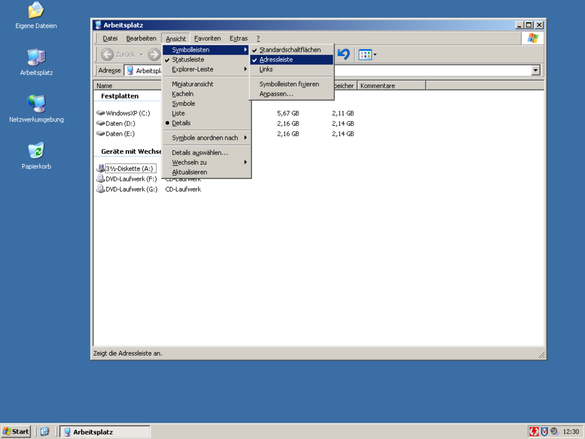
This way it becomes easy to memorize key sequences; start by navigating with arrow keys, then eventually speed up as you memorize each menu item's mnemonic key, and if you ever forget, just look at the menu.
It was the keyboard-friendliest idea ever, without requiring any sort of terminal. I'd even say friendlier than MacOS (heresy!!) or, yes, VIM (burn the witch!!!)
So even if the developer forgot to configure mnemonics, which was as easy as prefixing a letter with ampersand, you could navigate by keyboard. Sometimes tedious but beats not being able.
> I'd even say friendlier than MacOS (heresy!!)
Honestly, I disagree. If you've used macOS for a length of time, you might be aware of the universal menu search system using (cmd+? i.e. cmd+shift+/). Hit that, type the menu item name, and simply hit return to activate it. Doesn't get simpler than that. The alt+ system always feels very janky to me on Windows because on many apps, hitting Alt relayouts the entire app sometimes to show the menu bar on top.
And trying to satisfy every audience at once is a good way to satisfy none. You don't want your app to be a Jack of all trades; focus is really valuable.
I think this is a bad reason. Even MS Office has made this work. But I've seen people act on this type of argument. If nothing else, it should be possible to have a settings menu where you can define your own. Even if no shortcuts are set by default and they aren't shown anywhere else in the UI, it will still be possible for a power user to make the best use of the program.
Underlining the accelerator key is subtle and shouldn't be overwelming. Keyboard navigation unaware users probably won't even notice.
> This works poorly if you intend to localise your application. Great if you don't though.
Sure that's true. But remember M$ allowed you to fairly easily edit those underlined-characters in, oh, for example Office 2002 and 2003. Even if you didn't have a lot of default underlines in your current language settings, it is still possible for someone to add their own underline-shortcuts.
Back in those days, the first thing I did on any personal new install of Outlook, was to disable the shortcut that marked all email as being read. (That's cause I hit that button by accident too many times.)
That's a feature that was hidden from me at least, but honestly, this is a good-ish solution to that problem.
I remember Office having the underlines, but they were inconsistent between the original English and my localised version (and I used both depending on the machine), which made them useless. That wasn't that big of an issue when all the normal keyboard shortcuts are also written out, but it would have been even less of a problem if I knew how to edit them.
Even for keys that aren't mnemonic, do you want undo to be ctrl + z or ctrl + the key closest to left shift?
Hence my original comment. I haven't had a problem with different keyboard layouts, since most of the keys that change are on the outer edge, nowhere near where the most common shortcuts are located (then again, I rarely type using QWERTZ).
> Even for keys that aren't mnemonic, do you want undo to be ctrl + z or ctrl + the key closest to left shift?
CTRL+Z, since that's what it's been since time immemorial, even on ISO keyboards. Consistency is king.
To be fair to your point though, that's what most localisation of programs are these days.
Every application did it for decades after the first Xerox guidelines up until Microsoft and Apple decided to retire the concept of usability some time around 2010.
That is not a requirement, having access to menus, a master help shortcut ir fuzzy search actions shorcut are other options.
My wife is a UX Design consultant and she had an engagement where a bunch of state government accountants were bemoaning how a redesigned procurement platform took away all their keyboard shortcuts.
Majority of computer professionals (programmers included) come to appreciate a single fundamental truth about their field way too late into their careers. That the most basic foundational unit, the substrate they need to conquer is text. Everything stems from it. We have to deal with text our entire lives. It doesn't matter where that text appears - in web browsers, in Jira, in Slack, in terminal, in PDFs, Word or LaTeX documents. Code by the way is just structured text. The feeling of empowerment and liberation when you can deal with text on your own terms is a disproportionate multiplier. That's why using multiple cursors feature for the first time feels so amazing, even though the practical cases for it are not that common.
And when I say "text", I don't only describe the process of "grabbing some text" and "piping it" into another process, or manipulating it. It's not only about the input, the act of consuming text is equally, if not more important.
We argue that keyboard-driven UIs are more efficient for the input, but hundreds of memorized shortcuts can't really fix the fundamental problem.
Vendors are designed to own you and ownership can take different forms. Slack app that doesn't let you easily extract code snippets from a thread - owns you. Jira that forces you to use their stupid, quirky wysiwyg editor - owns you. Note-taking app that keeps the data on the cloud ain't your friend. The friction is the ownership. When extraction of text requires effort, the tool has leverage over you. It's a subtler form than data lock-in, it is behavioral lock-in. You adapt your workflow to what the tool makes easy, and gradually the tool's affordances shape what you even think to do. Information gets buried in threads, search is mediocre, export is hostile. The "solution" they offer is to stay there longer - search in Slack, link to Slack, screenshare in Slack, summarize with AI in Slack, don't ever leave Slack. The tool becomes the answer to the problems the tool creates.
And when you get to that point, you'd feel helpless - all your knowledge and muscle memory can't help you there - not only the app is not favoring power-user experience, it's forcing everyone downgrade to the "average Joe" levels.
Most popular editors and IDEs don't give you direct leverage over plain text either, at least not without the effort from your side. Shortcuts, popups, UI elements in the IDE at best are local drivers - you can't easily grab a thing from the outside and feed it to your LLM context in the middle of a task, or insert within a comment in the code - you have to switch, copy, paste, deal with format inconsistencies, manual conversion, etc. Then we keep bargaining what method is the best, fastest and most convenient - using the mouse or keeping the fingers on the home row, modality or complex shortcuts. All for the sake of the problem that's artificially enforced on our workflows.
Terminal-heavy users eventually start appreciating the leverage Unix philosophy grants them over text, but that's still contained within locality, they still have to constantly jump around, while eventually figuring out ways for automating some aspects of it.
Point is - do not give in to the status quo. Liberate your text - deal with it on your terms. Get annoyed whenever you need to switch back and forth just for the sake of finding the piece you need and moving it around - it should be instantaneous and instinctual. Like a boxer moving in a ring and casually throwing heavy punches. Long-time Vim and Emacs users "get it", even though they often don't follow through - some things just never become gratifying instincts. Sometimes, even the opposite forms - like redundant muscle memories. Some outright would reject using a new app because it messes with one shortcut they keep accidentally pressing. Sometimes, I wish there was an agreed standard for every UI - to have only the core, commonly used keys pre-set, while making everything else configurable.
Push a button, every icon is now labeled with a key, type that key, counts as a click, done.
I get that this does NOT solve for say, someone who's blind (i guess you could announce them, not sure), but it is easy enough I've found even lower tech people are fine with it.
As always, a lot of the trick is communicating the interface and using modern standards, not "Well it's ctrl + insert because that's what it is on linux"
God forbid I should ever be forced to use Blender or Inkscape with only buttons.
Most reasonable people want support for both keyboard and mouse-based navigation. For example, why did Edge and possible chrome, remove support for Back via the backspace key? Literally, why remove something that exists and that some people might use?
Same with some web forms where hitting enter in a text box does nothing. I expect it to submit a form, but very often, it does nothing.
Because people were triggering it by accident all the time. Firefox and Safari don't navigate back on backspace either.
Enter only auto-submits if there's a visible submit button or if there's just one input, and that behavior goes back as far as I can remember.
It should have been Ctrl-Backspace or something.
About enter to auto submit, i've been running into this problem more often where some web frameworks just ignore the Enter key. There is a submit button, but i cannot trigger it via the enter key.
It's also far less likely to be accidentally typed while trying to fill in a form and fumbling the tab navigation.
Because alt+left is a better choice? Really f**ing annoying when some dumb javascript removes focus from a text box you're editing and the page navigates back.
I can kinda get that one.
Because web pages don't preserve element focus well, web was originally meant for documents in the first place, not UIs. If you're trying to erase a character and the focus has been lost, you go back in history instead. It's a real existing problem in poorly designed pages, not a nefarious plot to annoy power users by Google, Microsoft, or Mozilla. It was always janky as hell.