
It's just a giant stack of edge case exceptions that mostly does the thing you'd expect it to, sorry about the UI, it's very much just in the exploration stage.
Some hate it, some love it.
My perspective on this post is, great! Another idea I can add to my bookmarks for when I’m designing.
Appreciate the OP!
One consequence of that is that they scale more nicely for nesting: https://thatsmaths.com/wp-content/uploads/2016/07/squircles-... (right half of the image)

Of course, Apple’s squircles deviate from that by inserting straight line segments. What remains is that the corners still have a non-constant curvature.
In digital graphic design curvature discontinuities don’t usually cause mechanical issues, but discontinuities in curved shapes can still look jarring – for whatever reason the visual system is rather good at detecting such sudden changes in shapes, even those that naively "should" look smooth.
A squircle is one (actually several variations) approach to making the curvature continuous.
I would say it's still a subjective aesthetic difference, but you can use math jargon to explain why you like one better than the other.
Personally, I prefer regular old round rectangles. Squircles are ugly.

(My interpretation)
There's a wonderful book about it: https://link.springer.com/book/10.1007/978-3-031-13783-9
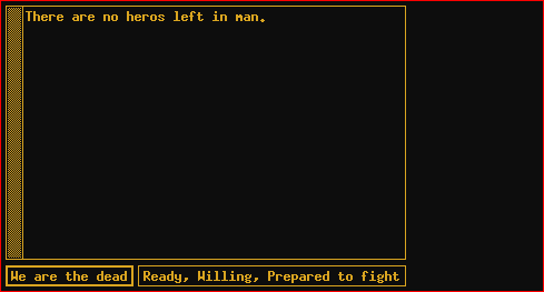
The fun thing is athena toolkit widgets can actually be made to look halfway decent. Put a "*shapeStyle: rectangle" in your xresources. My xmessages have never looked sharper. [1]
1. A blatant lie, I have it themed to look like an old amber monochrome monitor. But "if" I had employed some tasteful pastels my xmessages would look sharp. https://nl1.outband.net/image/xmessage.png
Amazing.